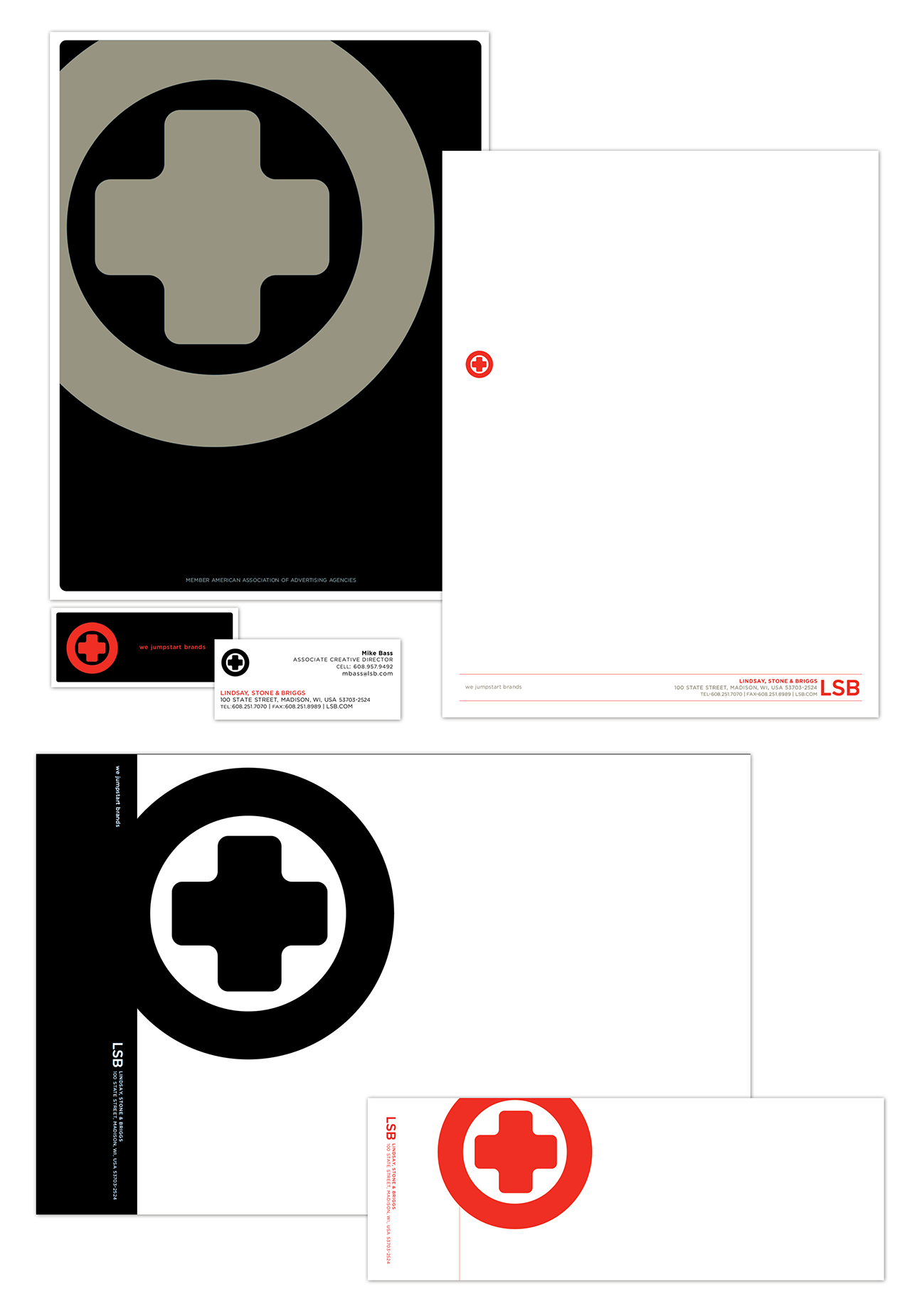
When the agency you work at needs a new identity, you soon find out that your creative director, agency partners and most importantly a very discerning CEO become a very precarious path to travers. It's not easy to remind that folks that sign your paycheck that the work isn't for them, but our consumer. The agency brand statement at the time was "we jumpstart brands" so after the usual brand analysis and strategy discussions, taking in all of the prefernces of the afore mentioned players I began sketching. Idea after idea was presented, idea after idea was shot down until at last the idea of the car battery, and more specifically the positive post of a car battery, the one that creates the spark took shape. It obviously couldn't just be a "+" sign with the name slapped down next to it, it had to be more stylized to invoke the creative and strategic nature of the agency. The mark that was created had a bold weight to it, a rounded plus within a circle. Although the positive space presented a bold statement and was indicative of our small group of innovative marketers, it was the play of the negative space that gave the mark true energy. Once we had consensus, we moved on to breathing some life into the identity by adding a color palette.
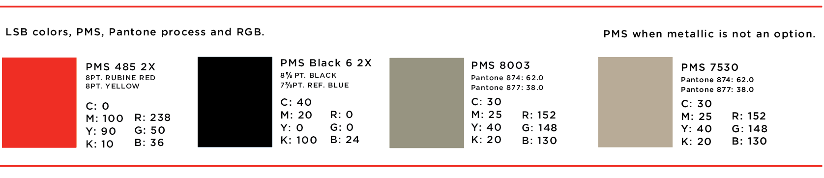
The previous color palette for the agency had been a royal blue, vibrant orange and a similarly vibrant yellow. When we set out of select a new one, we wanted to ensure that the new identity reveal would truly be noticed. Red, the color of passion, energy, caution, was a powerful choice, which we balanced out with a very rich black, the color of power and sophistication. A warm metallic, almost pewter added a tactile feeling to the printed materials, also gave it a feeling of value, the slight tarnish lended a bit of "been there, done that" we've seen it all and can handle it sentiment.
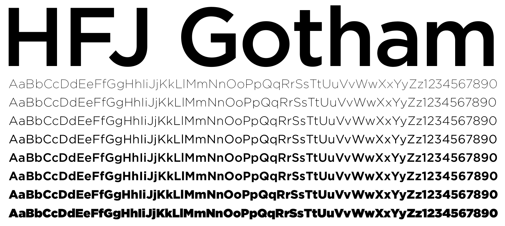
HFJ Gotham was chosen for the brand font. Contemporary in appearance as well as having a very large number of family members made it flexible enough to serve as a hard working member in our brand kit.


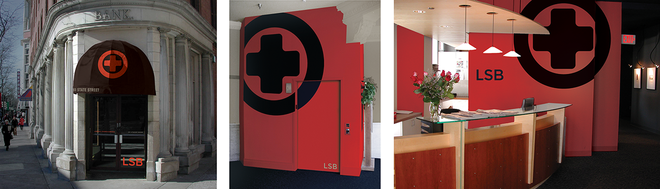
Texture and patterns were added to the mix, the overlapping concentric circles representing both social interaction as well as how our message interacts with others. The crisscross dot pattern reflecting the vast amount of sources for information. But, the most powerful icon we had with in reach remained that bold positive symbol and the many way we could present it.

Rules were put in place that more than 60 percent would always be visible, but beyond that the icon could be cropped. Given the boldness of the mark on its own this led to some interesting solutions.
The application was then utilized in collateral, agency communication templates and presentation materials
And onto additional materials such as a garment gift tag, note card and dvd and cd case.

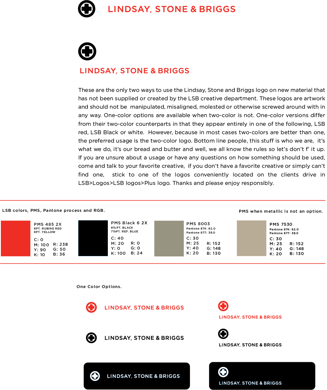
In addition it provided on of the simplest brand guides I've ever created. A little cheeky as well, because let's face it, this was produced for the agency itself, and if we don't know how to do it right, we got more to worry about than a new identity.